The AAG Council in February 2024, as part of efforts to establish the renewed sense of strategic direction for the association, took a decision to adopt a new visual identity for the association – one that was not only to symbolise a new era, but also to demonstrate the determination with which the AAG was being revived. The Council established a Rebranding Committee which was mandated to execute this project to give the association a new visual identity.
In a quest to ensure the AAG membership community was involved and felt a sense of ownership to its identity, the Council approved a Logo Competition as a means to make the process of rebranding the association an engaging one for members and the broader creative community in Ghana.
The Logo Competition was opened for entries for one month, and closed for selection and judging process for another month during which creative and business leads of member agencies were enlisted to facilitate the processes. Entries were competitive, with a final shortlist of 3 top entries, which were refined for final selection.
The winning logo was designed by Mr. Emmanuel Mihilov Mann, a brand identity designer who has honed his design craft through personal learning and hands-on experience. He was awarded with eight thousand Ghana cedis (GHS 8,000) and a Wacom Tablet, presented to him at the Annual General Meeting (AGM) of the AAG in November 2023. The new AAG visual identity has since been in the implementation stage, as the association adopts the new visual assets to its operations.
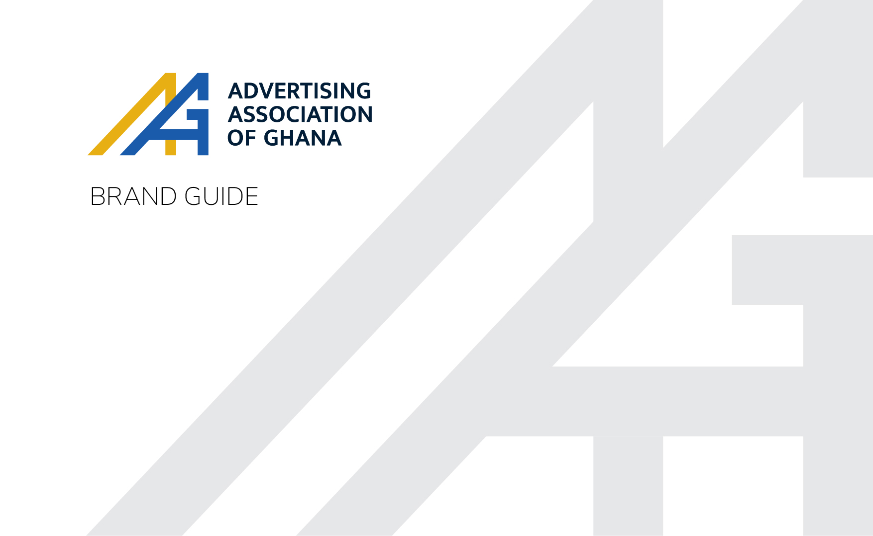
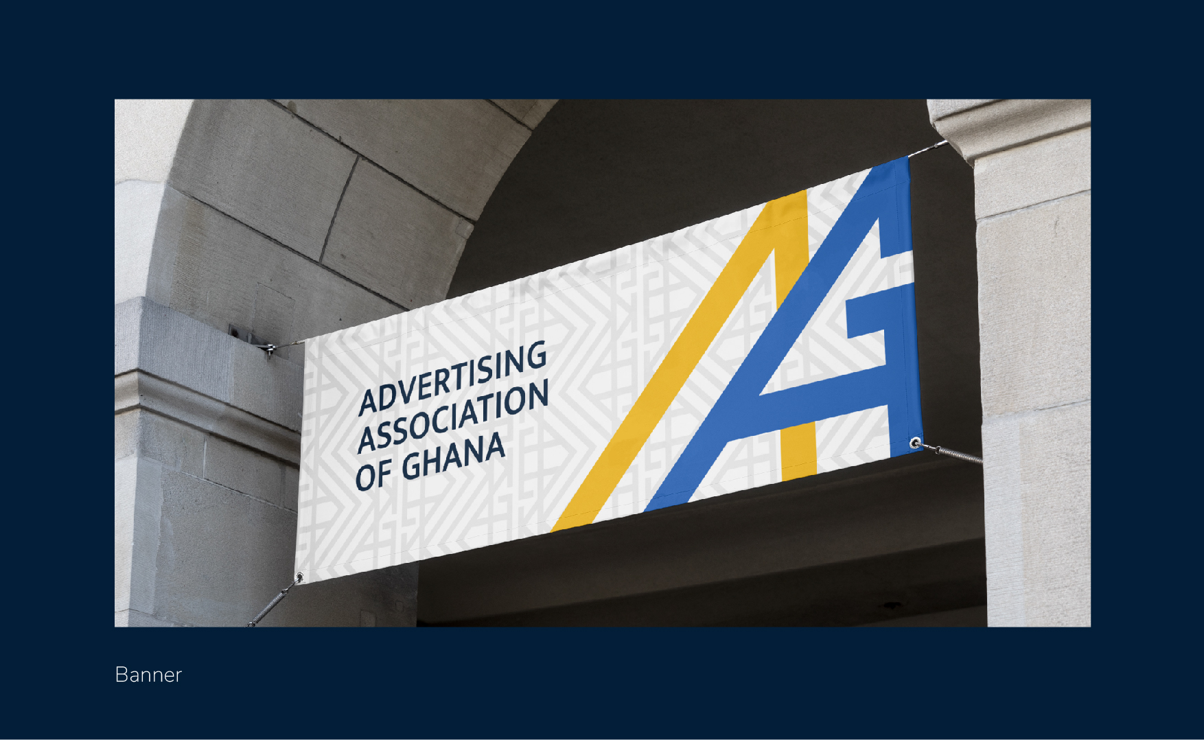
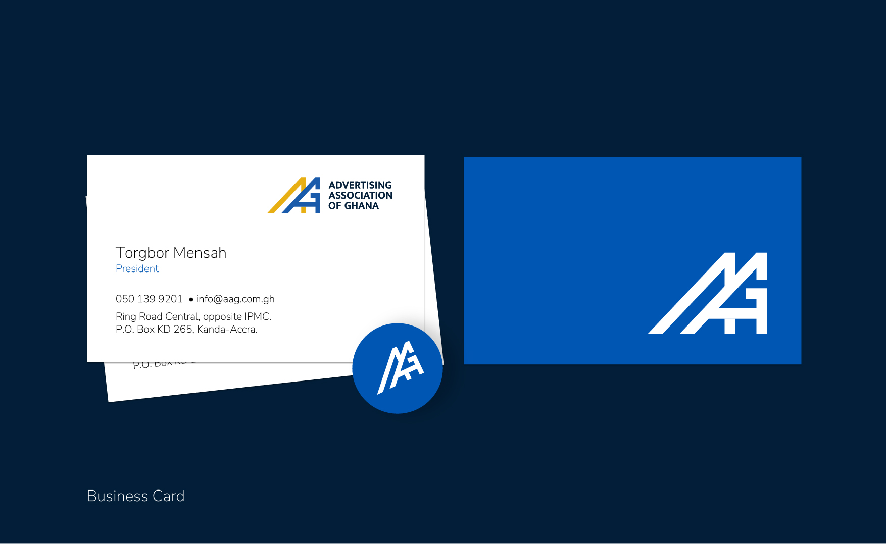
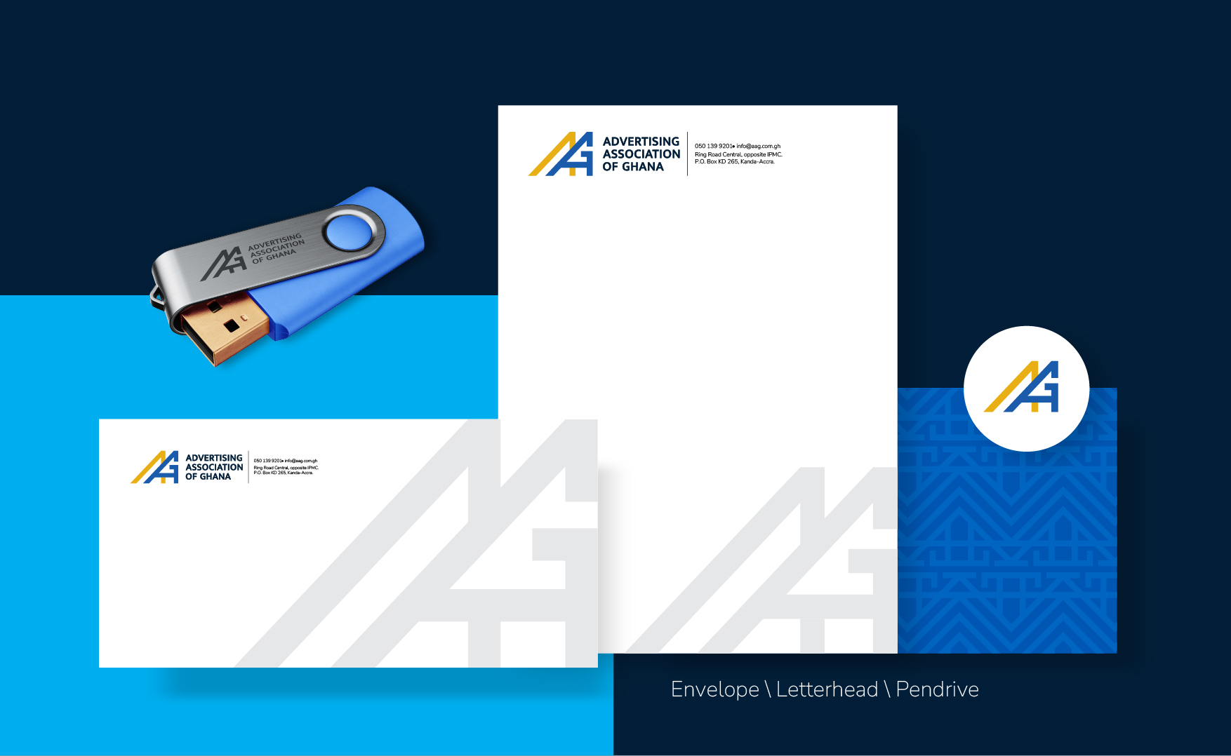
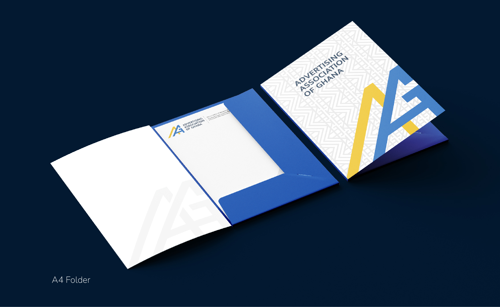
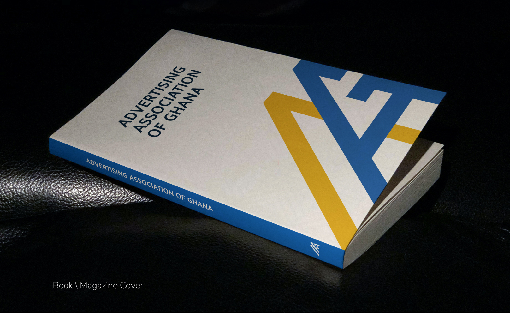
The new identity has been described as clean, familiar and yet still refreshing, as the elements of the former logo have been reimagined in a modern geometric assemblage, and accented with a distinct gold colour, bringing a fresh essence of vibrance to the AAG’s image.
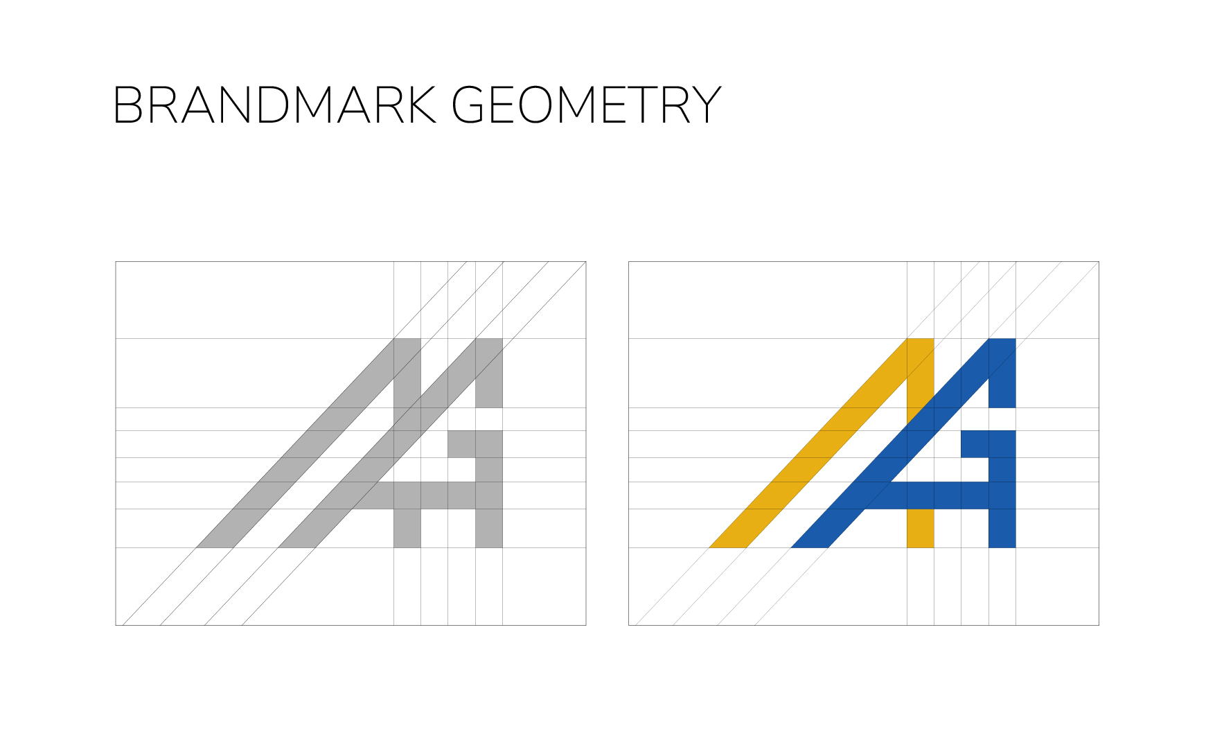
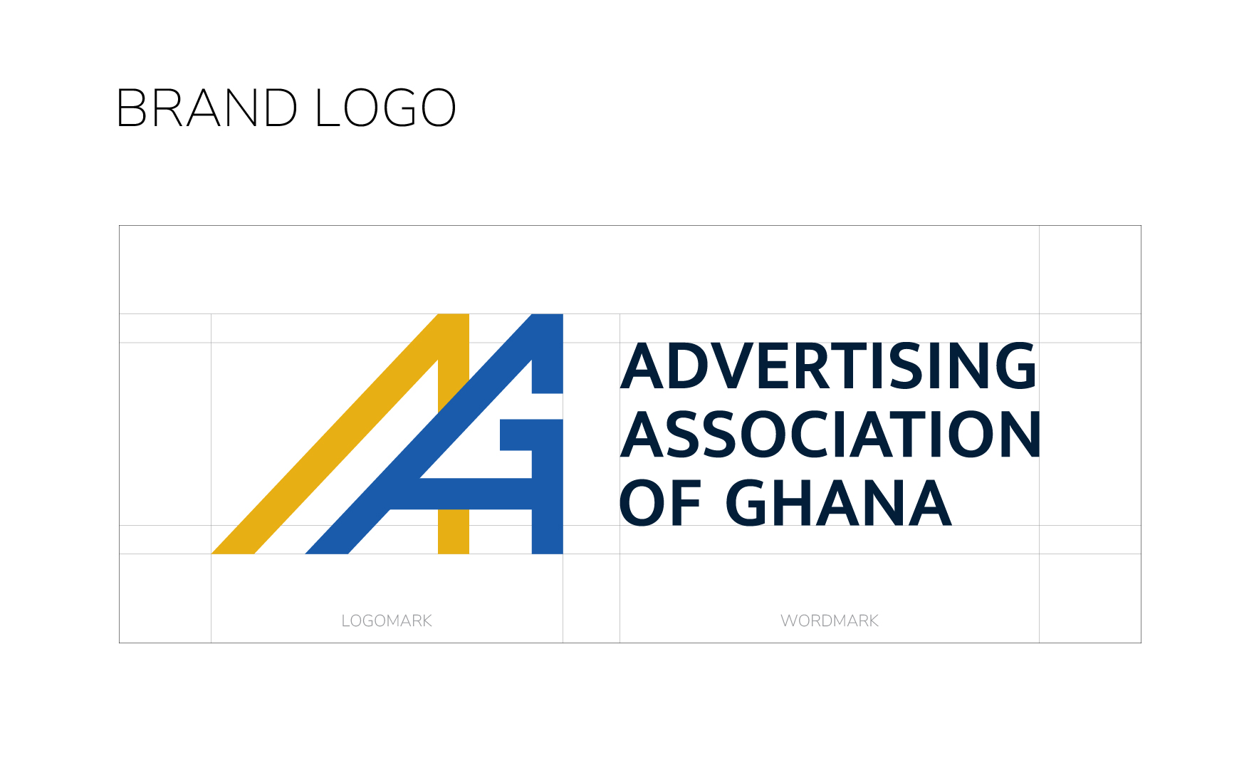
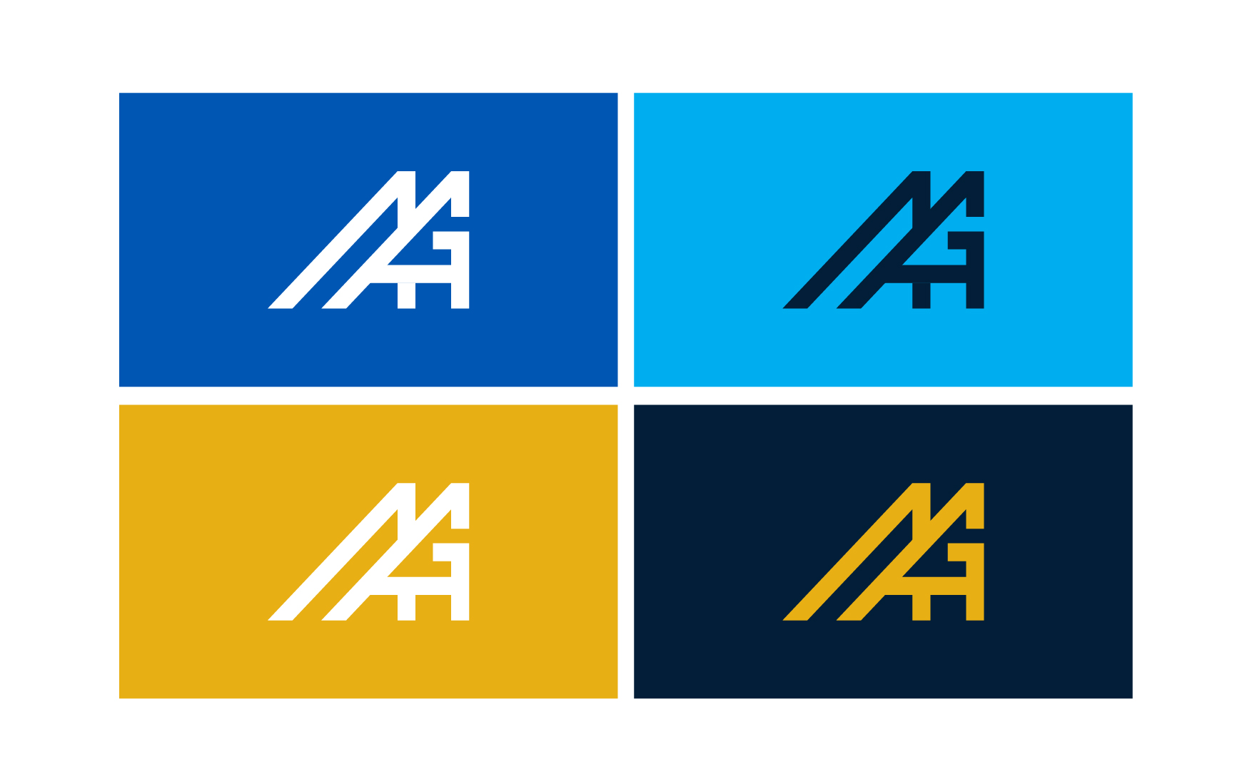
The icon of the logo, crafted from the initials “AAG”, is a symmetric work of art; cleverly integrating the letters, maintaining precision of lines and widths throughout the whole.
The logotype accentuates the geometry of the icon, with the name of the association crafted from a serifed font that offers both curves and straight lines in ample proportions. The icon and logotype together make up the new AAG logo.
The colours are an undeniably fresh take for the association; a vibrant blue that holds the seriousness of a corporate organisation and uprightness of a trusted partner, a regal gold that holds the honour of excellence and legacy while shining the brightness of the sun, symbolising the new dawn in the association. A darker blue is featured as the colour of the logotype which ensures the boldness and authority of the AAG is highlighted.
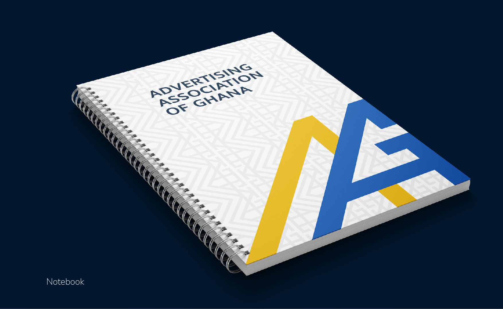
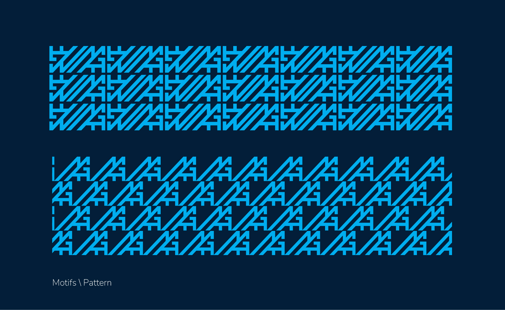
Another exciting feature of this new visual identity is the set of unique patterns crafted as added visual assets, that augment the application of this new identity anywhere.
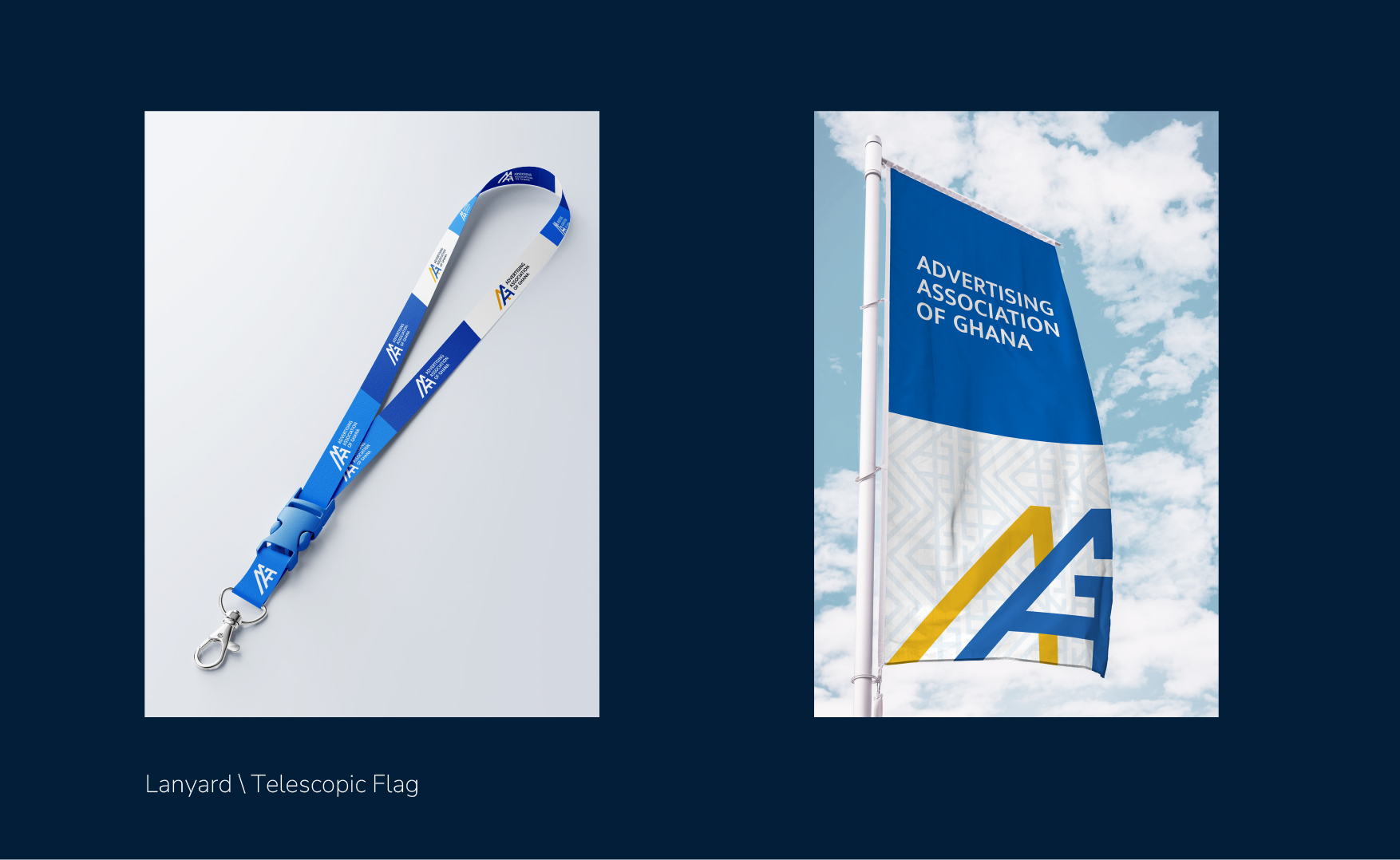
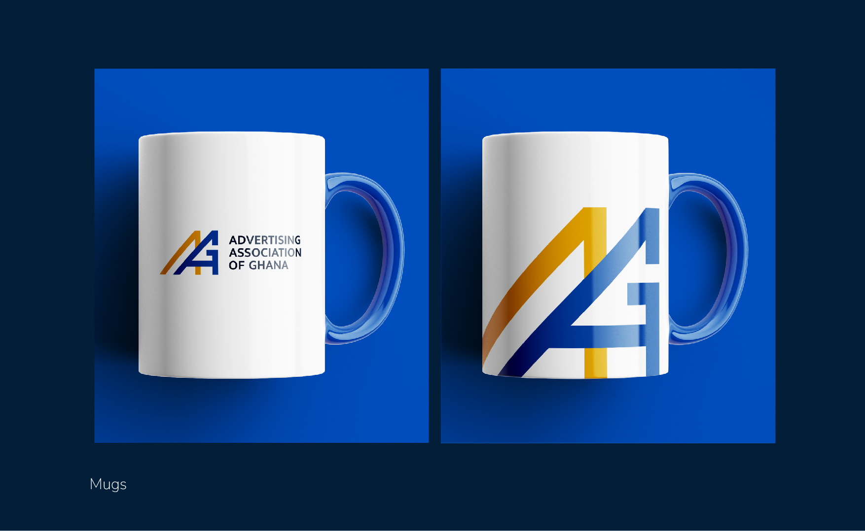
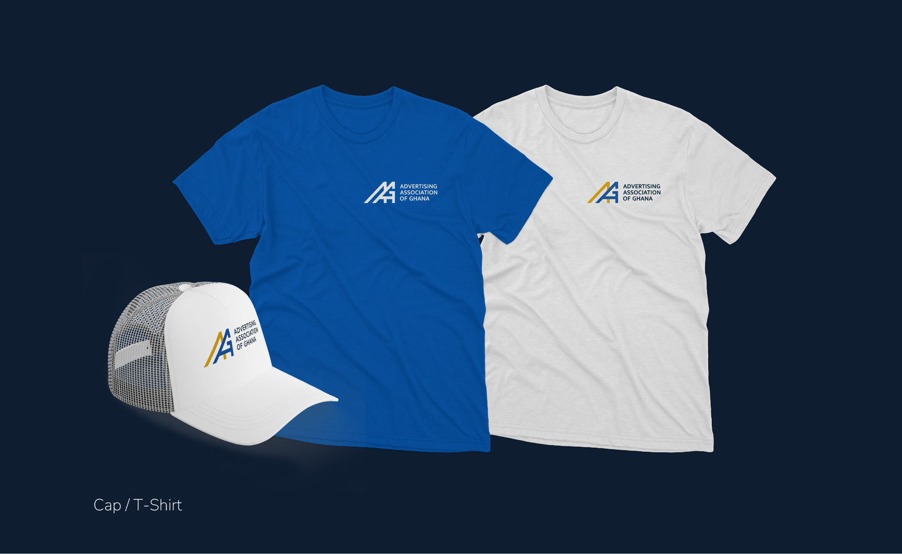
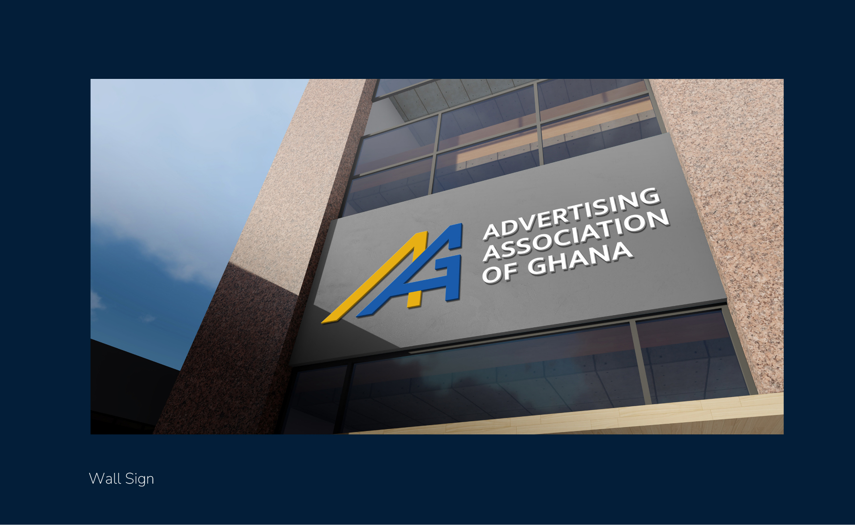
As the new identity continues its roll out journey, members will find that the secretariat office has already undergone its change, clad in the bold new visual identity from its external walls to the details in the conference room. All digital assets including our website are taking on this new identity and soon, a selection of cool, irresistible AAG merchandise from t-shirts to power banks will be available for sale to our membership and friends.
The Council has been as dedicated to the revamp of the AAG visual identity, just as much as it has been to the operational and strategic success of the association. The onboarding of the new identity and the related on-going investment is yet another display of the Council’s commitment to a thriving and impactful association.
AAG Secretariat
June, 2024.
No comment yet, add your voice below!